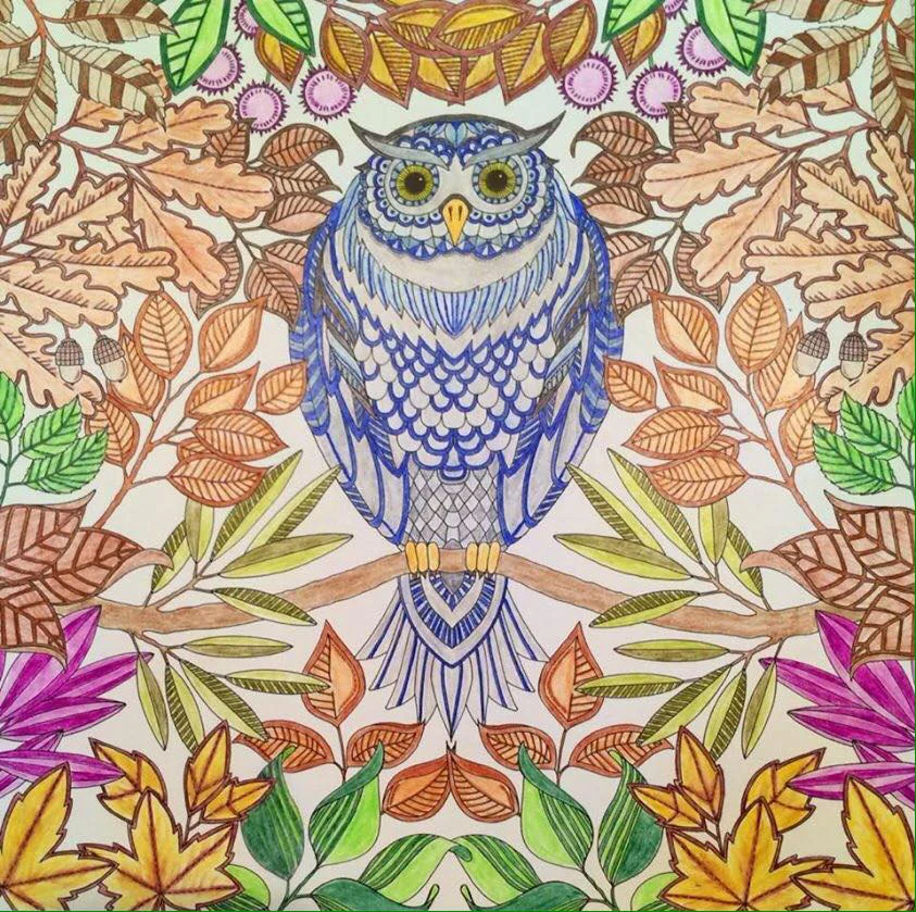
Coloring courtesy of Shelly Durham. Notice the "cool" owl surrounded by the "warm" foliage. Illustration from Secret Garden © Johanna Basford
Have you ever faced a clean new coloring page and wondered where to begin?
Some colorists just plunge in and let their intuition be their guide. If you're that colorist, it works just fine. Some of us feel less secure and need some guidelines. Here's a formula you can rely on when you're not sure how to begin. Keep in mind that formulas are only beginnings so let yourself bend the rules as you go.
Whether you feel you need guidelines or not, it's fun to see what color can do.
Warm-Cool Color Harmony
Decide whether your page will be mostly warm or mostly cool and try one of the following two equations:
- ¾ warm colors and ¼ cool colors
- ¾ cool colors and ¼ warm colors
Proportions are approximate; don't worry about being exact.
Warm colors are the colors of the sun: reds, oranges, yellows.
They tend to produce moods of energy, passion, and optimism.
Cool colors are the colors of water: blues, greens, purples.
They tend to produce moods of calm, contemplation, and peacefulness.
The smaller proportion will attract visual attention. Playing warm against cool (or cool against warm) creates visual contrast and helps all your colors come alive. For example, if you are coloring a cat on a couch, you might consider a yellow cat against a blue couch. The blue couch could be against a blue-green wall.
Or a blue-gray cat against a coral couch. The coral couch could be against a peachy wall.
In either case, the cat will stand out.
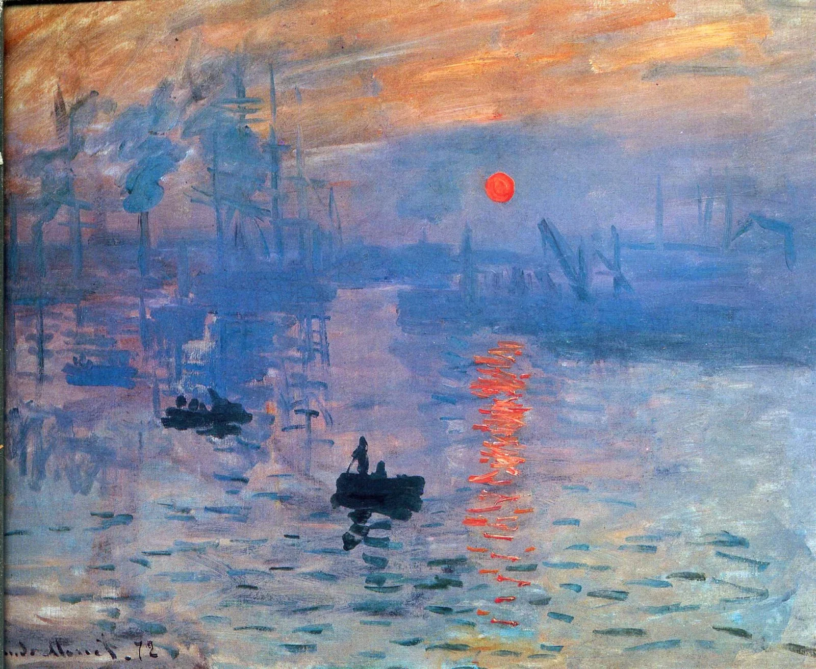
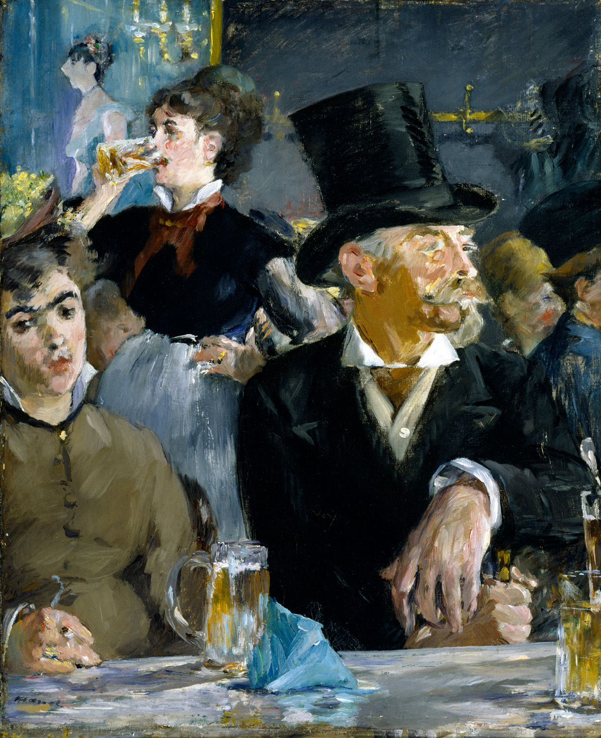
What's amazing is that the warm-cool concept usually follows our natural color sense. Many great masters used this system, either intentionally or intuitively. Look at Shelly Durham's coloring at the top of this post for an example. And refer to the examples below.
Best Advice
Whether following a formula or not, be true to your personal expression. That's what being an artist is about.
"Paul Gauguin - Fatata te Miti (By the Sea)" – The bottom pink is somewhat warm, but the figures against the cool background are a good example (Licensed under Public Domain via Wikimedia Commons)
"The Mummy 1932 Film Poster" – Universal Pictures, attributed to Karoly Grosz. This movie poster is more like half warm and half cool, but notice in particular the woman in the lower right who is bathed in warm light and stands against a cool shadow. (Licensed under Public Domain via Wikimedia Commons)
"Into the Light" by Collin Bogle. This beautifully demonstrates the interaction of warm and cool colors. View his photorealistic paintings.


